rm(list=ls()) # clear environment

# Load necessary libraries
library(ggplot2)
library(forecast)
library(tseries)51 Exploratory Time Series Analysis - Practical
51.1 Introduction
The previous section on Exploratory TSA covered a lot of ground.
We’ll break this down into short stages in today’s practical session. This session will cover very basic concepts only.
51.2 Time series analysis: demonstration
Step One: Preparation
First, I’ll load some libraries.
For this demonstration I’m going to create an artificial dataset with two variables: Week and Speed. This represents the average speed a runner has achieved during training each week for a full year.
Show code for data creation
# Average running speed of an athlete over 52 weeks
set.seed(123) # For reproducibility
weeks <- 1:52
speed <- round(10 + rnorm(52, mean = 0, sd = 0.4),2) # Average speed with some random variation
sports_data <- data.frame(Week = weeks, Speed = speed)
rm(speed)
rm(weeks)

head(sports_data)
Week Speed
1 1 9.78
2 2 9.91
3 3 10.62
4 4 10.03
5 5 10.05
6 6 10.69So we have one observation (Speed) for each Week that has been observed.
We can say this is a time series because it a regular capture of information on a consistent time frame.
In order to take advantage of the specific features of TSA, we need to tell R that the data is actually in the form of a time series.
Step Two: Creating a time series object
So, we convert the dataframe sports_data to a time series format.
If we don’t do this, R won’t know that it’s a time series, and we will not be able to use specialised TSA functions to examine the important features of such data (such as seasonality, or periodicity).
This is critical, and worth taking some time to examine.
In a previous section, we introduced the ts command, which lets us tell R our data is a time series.
We’ll stick with the simplest form for now, which is ts(data, frequency). If you want to go further into this, you’ll find that you can create start and end dates as well.
In this code,
datarepresents the numerical data you want to convert into a time series. In our case, it’s theSpeedvariable.The
frequencyis number of observations per unit of time. For example, 12 for monthly data in a year, 4 for quarterly data, etc.
It’s important to understand how this works: we’re telling R how many observations we have for one year.
In our case, the data is weekly, so we enter 52 as frequency (and sports_data$Speed as our data).
# Convert to time series using the ts function
ts_data <- ts(sports_data$Speed, frequency = 52)
We can now plot this time series as follows. Note that I’ve added a simple moving average in red to help simplify the data. Also, notice that R has understood that each observation represents a weekly time period (with week one = 1.0, and week 52 = 1.9).
library(ggplot2)
library(zoo)
Attaching package: 'zoo'The following objects are masked from 'package:base':
as.Date, as.Date.numeric# Convert time series to data frame
ts_df <- data.frame(Time = time(ts_data), Value = as.vector(ts_data))
# Calculate the moving average
ts_df$MovingAvg <- rollmean(ts_df$Value, k = 12, fill = NA, align = "center")
# Plot using ggplot2
ggplot(ts_df, aes(x = Time)) +
geom_line(aes(y = Value), color = "blue") + # Original time series
geom_line(aes(y = MovingAvg), color = "red") + # Moving average
labs(x = "Time", y = "Value", title = "Time Series with Moving Average") +
theme_minimal()Don't know how to automatically pick scale for object of type <ts>. Defaulting
to continuous.Warning: Removed 11 rows containing missing values or values outside the scale range
(`geom_line()`).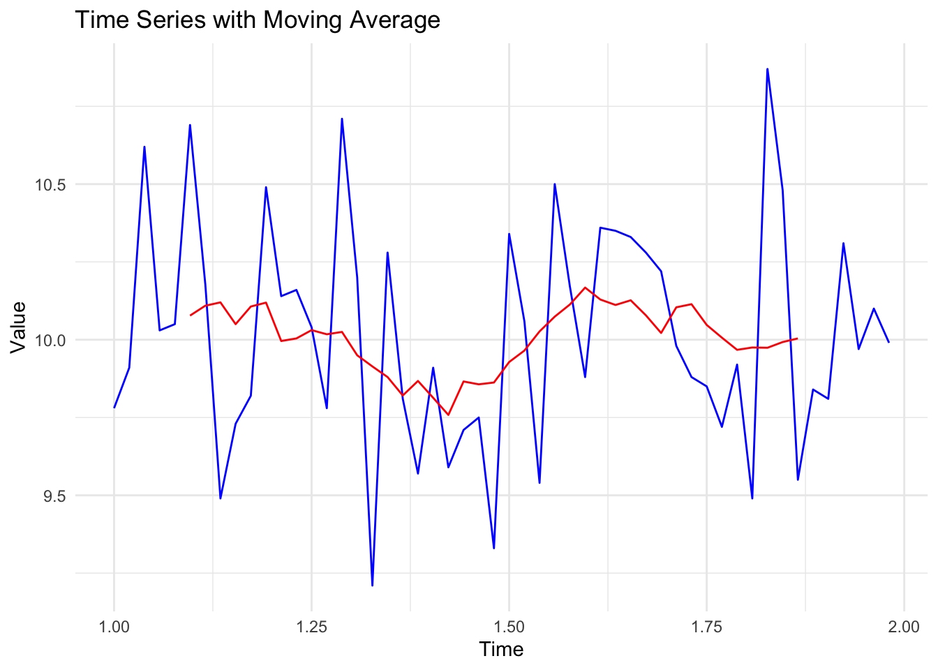
When creating time series data in R, I tend to think of the ‘big period’ and the ‘little period’. In this case, big period was a year, and little period was a week.
Imagine our data had been collected differently. Let’s say we had collected 52 observations, but instead of one per week, we’d collected five per week.
In this case, our ‘big period’ would be the week, and our ‘little period’ how many observations we have per week (5).
We’d create our time-series object like this:
# Convert to time series

ts_data_02 <- ts(sports_data$Speed, frequency = 5)
In this case, we’ve told our object that there are 5 observations per time period (i.e., 5 observations per week, or ‘big period’). Remember: our object doesn’t care what the period is…it just needs to know how many observations are in each period.
A plot of that data would look like this:
Show code
# Plotting the time series with 'Week' on the x-axis
plot(ts_data_02, type = "o", col = "blue", main = "Five Observations per Week", xlab = "Week", ylab = "Value")


# Apply a simple moving average
# Calculate the moving average over a window of 12 periods
moving_avg <- rollmean(ts_data_02, k = 10, fill = NA, align = "center")
lines(moving_avg, col="red")

# for clarity, I've added a vertical line at each week
for(i in seq(1, length(ts_data_02), by = 1)) {
  abline(v = i, col = "gray", lty = 2)
}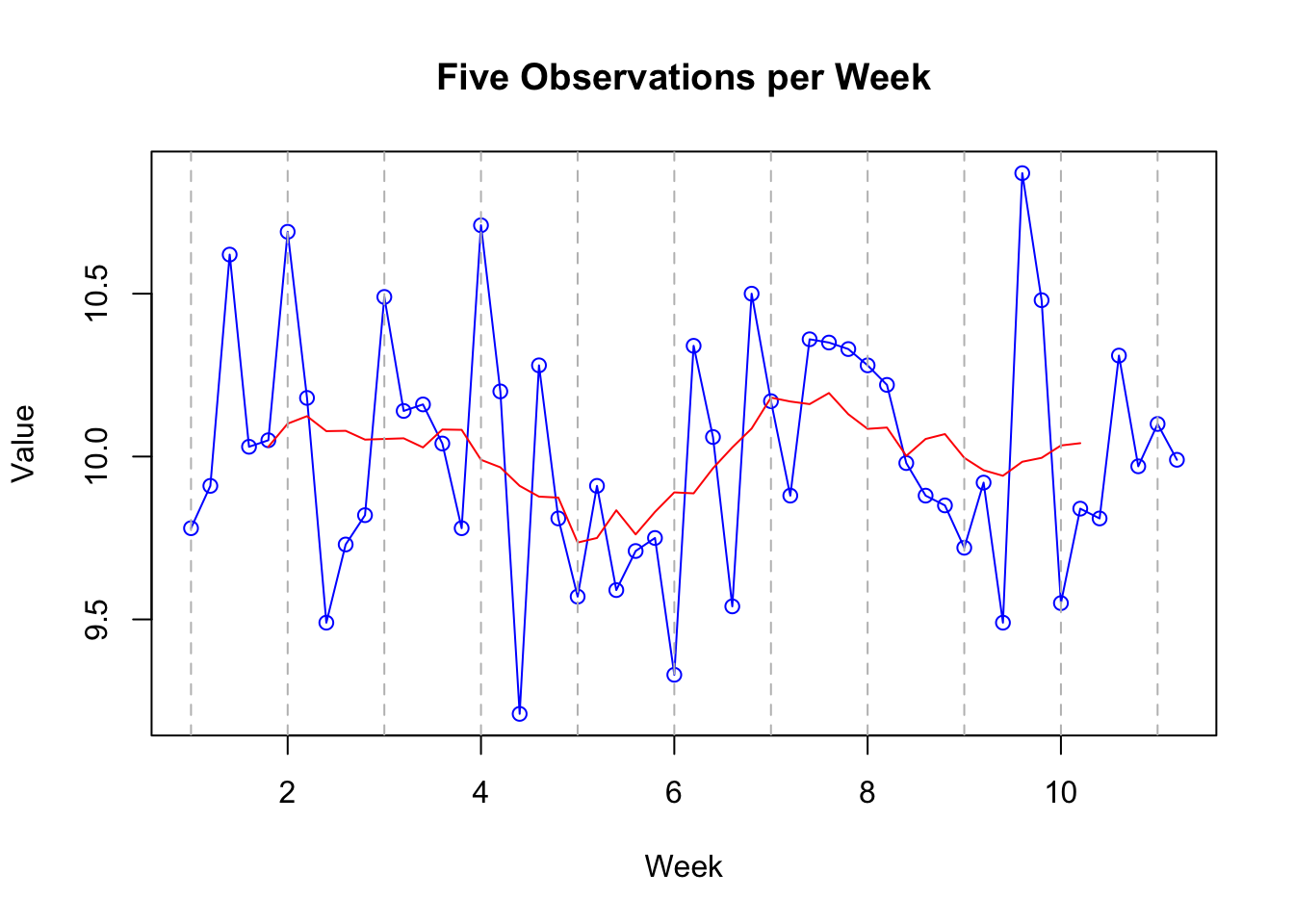
Note that it’s exactly the same! The only thing that’s changed is that we’ve specified our final time point as being 12 rather than 52, and that there are 5 observations per time period rather than 52.
This highlights the importance of having equal numbers of observations per time period. It wouldn’t work (well it could but we’re keeping it simple) if you had three observations one week, and six the next.
So we have covered the idea of creating a time-series dataset that can now be explored using specific techniques designed for such data.
Step Three; Examining trends and seasonality in our data
As noted earlier, one of the main things we’re interested in when dealing with time-series data are trends and seasonality in the data.
Reminder: what’s seasonality and trend?
Trend: in time series data, a ‘trend’ is the overall direction in which the data is moving over time. It can go up, down, or stay relatively flat.
Seasonality: ‘Seasonality’ refers to regular, predictable changes that occur in time series data at specific periods, much like the way ice cream sales increase in summer and decrease in winter. Note that the word ‘seasonal’ has nothing to do with the seasons of the year. The season is the technical term for the ‘big period’.
We can use the stl function to examine trends and seasonality.
Caveat. I am going to complicate this slightly by saying that this analysis requires more than one season (‘big period’). If you remember, our first dataset
ts_datahad a season of one year. But we only had one season (year) of data. Our second datasetts_data_02had a season of a week, and we had 10 of those. So we are going to use that dataset for this example.
# Time Series Decomposition
decomposed <- stl(ts_data_02, s.window = "periodic")
plot(decomposed)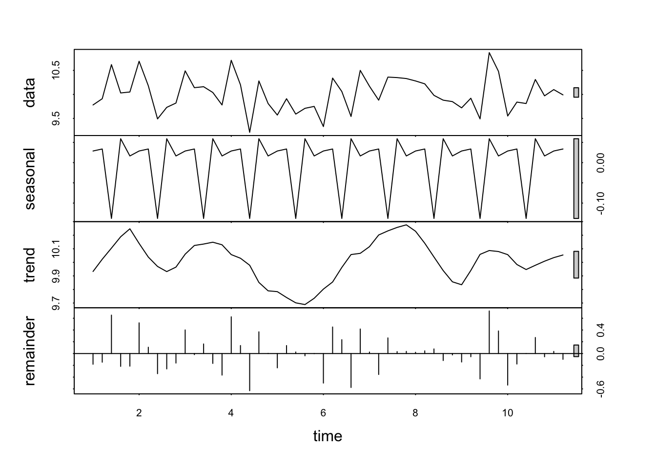
The resulting plot has four panels, each representing a different component of the time series. Because R understands that this data is in the form of a time-series, it can examine some specific features of such data.
At first glance it looks a bit complicated. Here’s how to interpret each of these outputs:
Data: this is the observed data. The plot is the same as those above.
Seasonal component: isolates and shows the seasonal pattern within the data. Look for regular, repeating patterns that occur at fixed intervals. For example, in weekly data, you might see a pattern that repeats every particular day (as is the case here). The amplitude (height) of the seasonal component gives an indication of the strength of the seasonality. Larger amplitudes mean stronger seasonal effects.
Trend component: represents the long-term progression or movement of the data, stripping away the seasonal effects and irregular fluctuations. It shows how the data’s central tendency changes over time. An upward trend indicates an increase over time, a downward trend indicates a decrease, and a flat trend indicates stability.
Remainder (Irregular or Residual Component): shows what’s left after the seasonal and trend components have been removed from the data. It represents the noise or random fluctuation that can’t be attributed to the seasonality or trend. Ideally , in a well-decomposed series, this component should appear as random noise, without any discernible pattern. If there are patterns in the remainder, it may suggest that the seasonal or trend components have not fully captured all the systematic information in the data.
What can you observe in the plots above, especially those relating to seasonality and trend?
51.3 Time series analysis: practice
Based on the steps outlined above, conduct a basic time series analysis for the dataset df that is available here:
df <- read.csv('https://www.dropbox.com/scl/fi/nh221nxwv0fp0fy773i2j/golf_data.csv?rlkey=666lxnhwazjpg70j9wgowog8x&dl=1')
df <- df[1:156,]
df$Date <- NULL
df$Score <- round(df$Score,0)
The dataset contains data gathered from a golfer who has recorded their average score for per week over a period of three years.
Notes:
Create an appropriate time-series object for the data.
Don’t ignore descriptive statistics and exploratory data analysis - these should be your first stages regardless of what you’re going to do next.
Focus on interpreting visual plots, as well as statistical output.
Be ready to report your findings regarding seasonality in the data.
Crucially, did the golfer perform better in certain seasons than others?
What was the overall trend in their performance over time?
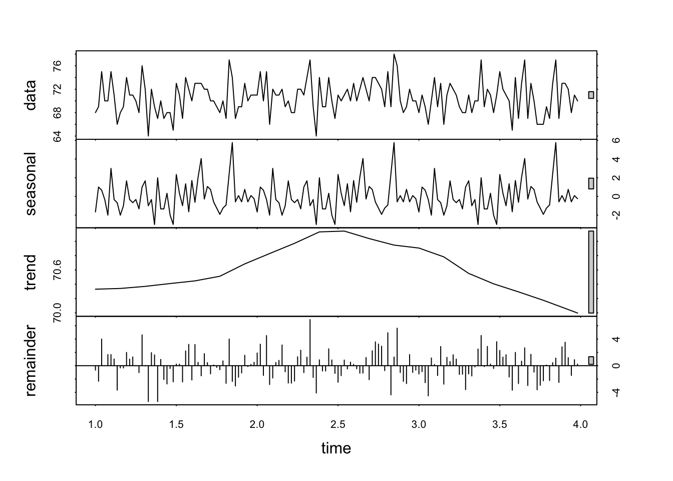
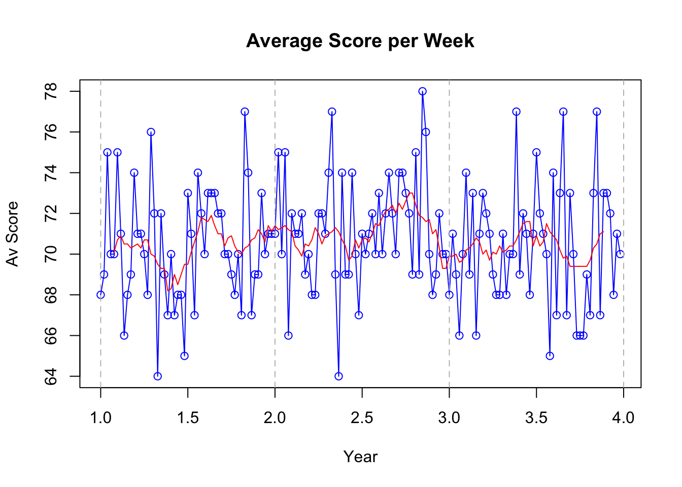
show solution
# Convert to time series

golf_data <- ts(df$Score, frequency = 52)

# Plotting time series
plot(golf_data, type = "o", col = "blue", main = "Average Score per Week", xlab = "Year", ylab = "Av Score")


# Apply a simple moving average
# Calculate the moving average over a window of 12 periods
moving_avg <- rollmean(golf_data, k = 10, fill = NA, align = "center")
lines(moving_avg, col="red")

# for clarity, I've added a vertical line at each year
for(i in seq(1, length(golf_data), by = 1)) {
  abline(v = i, col = "gray", lty = 2)
}
show solution
# Time Series Decomposition
decomposed <- stl(golf_data, s.window = "periodic")
plot(decomposed)